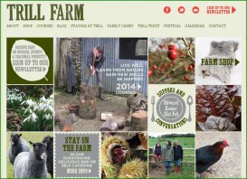
Trill Farm’s ‘mosaic’ style website
A good looking and uniquely dynamic cookery school website. The homepage comprises puzzle-pieces of beautiful photography and text that transport guests to various sections. Let the mouse linger over a text icon and it adds extra information in a pop-out box.
As expected for a ‘farm school’ there is plenty of imagery of animals, plants and people in wellies, wielding spades. Muted greens, autumnal browns, luscious reds and a ‘distressed’ typeface evoke the organic ethos. The whole impression is of a website that is alive and evolving.
Acknowledging the countryside location, there is very helpful information on how to get there via various modes of transport and from different parts of the UK. A link to all “2014 Courses” is clearly visible and leads to a list of course types that contain further details. As there are many courses on offer, this effectively ensures the overall look remains uncluttered.
Finally, the tagline is pure poetry: “Live Well, Learn from Nature, Gain New Skills, Be inspired”

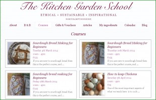
Juniper and Rose’s homepage is up-front and stylish
In fact, this website looks so sumptuous it makes you want to linger and take a look around, much like an art gallery. The blog drips with personality – take the “How I am Going to Eat my Sourdough” post as a prime example.
Juniper and Rose’s raison d’etre is neatly stated in the tagline: “Ethical, Sustainable, Inspirational”.

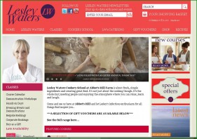
Pretty in pink: Lesley Waters’ homepage is packed with information
Other websites that excel and make us want to sign up include White Pepper Cookery School (a lovely homepage that proudly displays its awards, sports inviting pics and a link to a handy course planner), Leiths (high impact, modern scroll-form website with cookery class lists up front), Lesley Waters Cookery School (busy homepage but nice colours and smart course calendar), Rosemary Shrager’s Cookery School (a little bit modular but has a lightness and clarity to it with easy access to cookery course information) and Thyme at Southrop Manor (for a website that’s a couple of years old now the cookery school page still looks fresh and the simple lists, beneath seductive pictures, are effective).
And worth a mention:
Course details are very accessible and clearly demarcated with pictures of the guest tutors shown ‘in action’ flinging a fishing rod here, and firing a shooting rifle there.
The homepage is nothing short of a master-class in concise and effective communication. The header features a sophisticated logo and contact telephone number in a large font. Below this are clear sections for course-types, “news”, “about us”, course search filter, “recipes” and “reviews”.
The Spinney School of Fine Food’s website is not the most sophisticated in the field but it does have a simple and easy to use course calendar which depicts each month of the year with an attractive picture.
![]()
